Button
The Button responds to a click from the user and is used to initiate or confirm an action.
At create it, a Text is created as a child of the Button.
The Button is created with two components: Image component and Button component.
The Image component allows to set a texture as the background of the Button. To make the sprite scale properly, position the borders inside the borders of the button.
The correct image type for a button to have rounded corners is a Sliced.
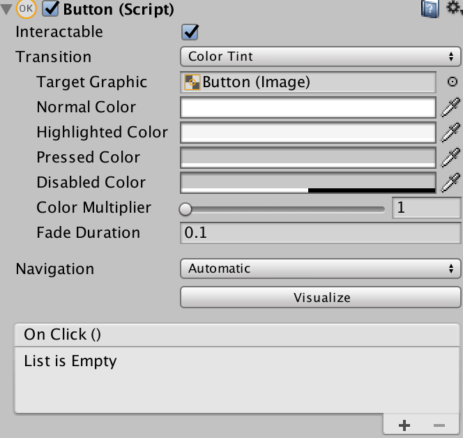
The Button components allows us to set Interaction, Transition and Navigation options to the Button object.

Interactable, enable/disable the interaction with the button
Transition, allows to set different options for when the Button is unpressed, highlighted, pressed and disabled, those options are:
None
Color Tint, changes the Button color
Sprite Swap, changes the sprite of the Image component
Animation, display an animation. An Animator component must exist and root motion must be disabled
Navigation, control how control navigation is implemented, there are seven types:
None, no keyboard/clicking/tapping navigation
Horizontal, navigates horizontally
Vertical, navigates vertically
Automatic, automatic navigation
Explicit, you can explicitly specify where the control navigates to for different arrow keys/click and draw/tapping and slicing
Visualize, this option gives you a visual representation of the navigation you have set up
On Click(), a UnityEvent that is invoked when a user clicks the button and releases it, you can attach a GameObject and select a function, for example a Script to do something or an Audio Source to play a sound